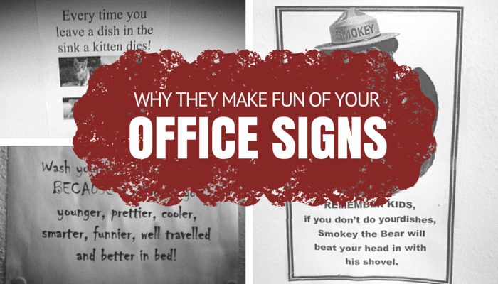
6 Reasons No One Takes Your Office Signs Seriously
Everyone in the office keeps <insert annoying behavior>. I know just the thing to fix the problem: an instructional sign.
We’ve all had this thought at one point in time. It’s not an unreasonable solution, especially when it comes to a problem that you find yourself dealing with over and over again. Generally speaking, well-constructed signs can be very helpful and informative. They communicate the rules of a given space and provide clear instruction to its inhabitants.
So, when it comes to office signs, why is it that things go so wrong so often?
My guess is that, by the time the sign-maker gets to the point of making a sign, it’s typically a Hail Mary move born out of equal parts frustration and desperation. It’s hard to do your best work when your hands are shaking with rage because you just washed someone else’s dishes for the 900th time.
We feel your pain. But, heed this warning: a crappy office sign can make a problematic situation even worse. The last thing you want to do is add to office tension or even encourage sabotage or retaliation among your colleagues.
So, spare yourself the misery and learn from the mistakes made by office ninjas before you. Let’s take a look at some of their failures and figure out what exactly went wrong.
Mistake #1: Excessive use of clip art
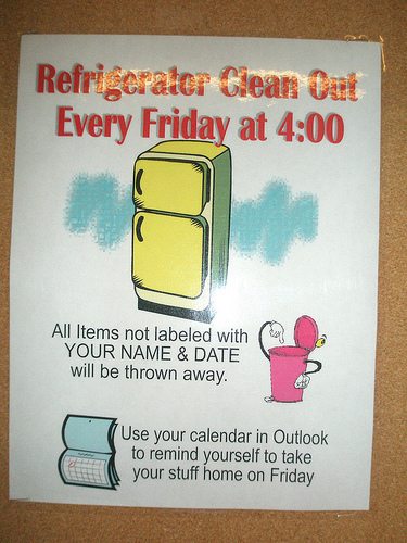
Really, any use of clip art is offensive. It’s dated looking (1994 is calling!) and inherently condescending. You (allegedly) work with adults. They know what a fridge, trash can, and paper calendar look like. A sign like this not only insults the reader, but it also makes the creator look out of touch.
Mistake #2: Annoying fonts
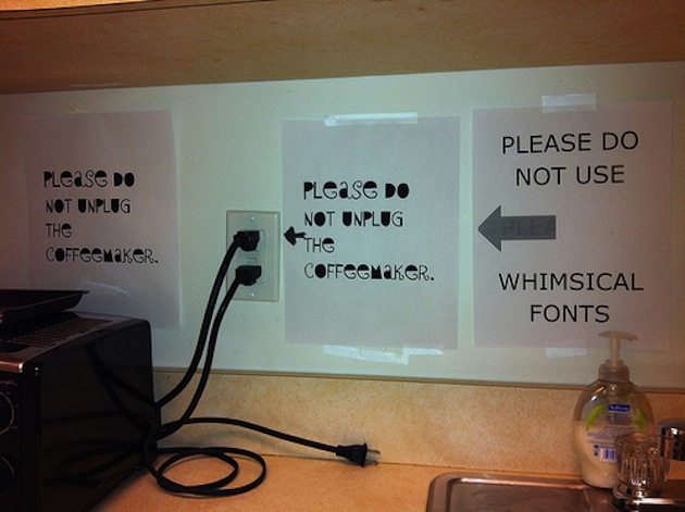
Choose an untraditional font only if you want your coworkers to spend more time decoding your sign than actually heeding its instruction. There’s a reason your tax returns aren’t printed in Wing Dings. Choose Times, Arial or another no-nonsense font if you want your sign to be read easily and taken seriously.
Mistake #3: Spelling and grammar mistakes
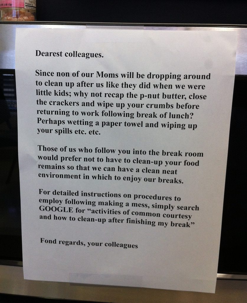
Yowza! This sign has a little something for everyone! Spelling mistakes, punctuation errors, random capitalization… My guess is that this person’s colleagues spent more time critiquing this note than wiping cracker crumbs from the table in the break room. If you’re not a great proofreader, find a friend with a better command of the written word.
Mistake #4: “Inspirational” Quotes
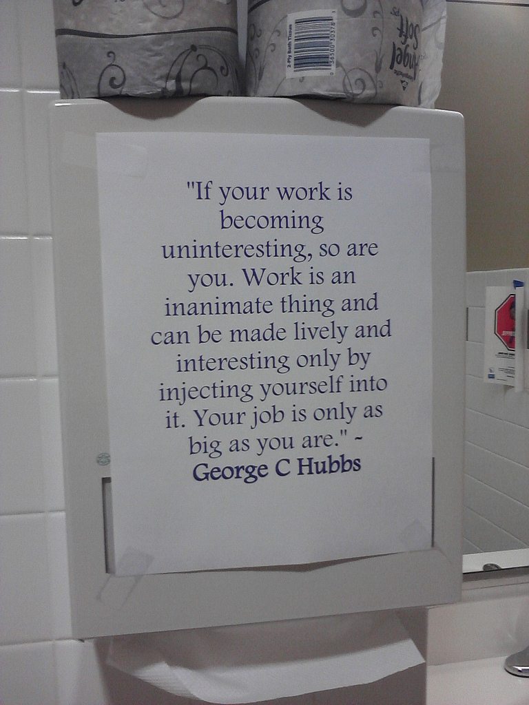
You may be thinking “I bet if people were more inspired at work, they’d follow directions!” The intention here was good…or was it? Actually, wait a minute. Is this “inspirational” restroom note suggesting that my boring job is all my fault?
When it comes to inspirational signs, you run the risk of looking cheesy, preachy or just plain rude. Not everyone in the office is searching for enlightenment, so leave the self-improvement talk to the real gurus like Gandhi and Oprah.
Mistake #5: Passive Aggressive Shaming
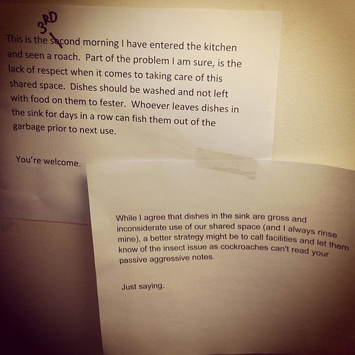
Want to see your coworkers bristle? Then I suggest mass-shaming everyone who uses the kitchen via a note signed “You’re welcome.” I know, I know – you’ve been staring at that crusty coffee cup for a week. But, as “Just Saying” demonstrates, this kind of approach makes you look like a complainer who doesn’t know how to solve problems.
Mistake #6: Nitpickiness
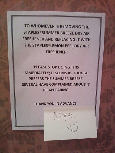
Effective office ninjas pick their battles. If you find yourself furiously typing a memo about bathroom spray preferences, it may be time to cash in one of those personal days.
Finally, keep in mind that a sign may not be the solution to every office issue. A sincere face-to-face chat with the dirty dish bandit may be a little uncomfortable, but ultimately more effective in the long run.
Have you witnessed any other office sign offenses? Let us know in the comments!
This was amusing but I was hoping for examples of signs or messaging that enroll cooperation without giving offense or inspiring eye rolls.
Oh definitely! We have our own “label” guy. Ivan the label guru. He even labels the labels…
Canva! Thank you for the reminder – I was running into creative block on office signs too and forgot about that site…
Canva is great if you want to make office signs look professional, but pop at the same time. I use Canva for everything from office signs, to office event invites, and reminders. It has everything to may need and can spark your creativity! And don’t for get to keep things simple.
This is was fun-ny! Thanks for the laugh.
Glad to make you laugh, Tiffany!
Personally, I don’t know what would be a good sign. People tend to selectively listen/read, so there’s no amount of signage that will work. However! If you notice no one’s washing their dishes and there’s a bit of an odor problem, make sure you add to it. Passive aggressive? Of course, but a stinky office is sure to get on everyone’s nerves, so they may shape up. If it doesn’t, meh, just start washing the dishes/other chore that no one wants to do.
Interesting tactic! ;) Thanks for reading!
I agree with Suzy Smith. Samples of what you see appropriate would be appreciated. If it’s more than one offender what would you suggest to get the point across?
Totally agree, Roz! A follow up post with tips for appropriate and effective signs is currently in the works!
Would love some samples of good signs. I’m “facility manager” and need all the help I can get.
Suzy, that’s a really good idea for a follow up post. Thanks so much for your comment!